





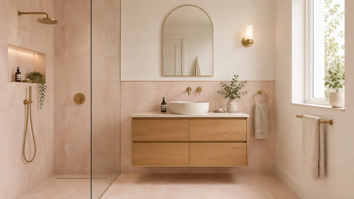
The best pink bathroom tiles suit three things: your room’s light, the surface you’re tiling and the upkeep you want. Before choosing blush, rose or salmon, compare physical samples beside your basin, paint and grout in daylight and under your bathroom lighting. Then check the exact tile’s suitability for its intended wall or floor. This guide helps you compare shades, finishes and layouts, build a coordinated scheme and calculate your order, so you can choose pink tiles with a clear reason for every decision.
Which pink bathroom tiles suit your room? Start with this comparison
Match your shortlist to light, tile location and cleaning priorities
Start with the room you have and its fixed features. A white bath, dark vanity or shaded window gives you a useful starting point for choosing the pink shades and finishes that feel balanced.
Decide where you want the colour to draw your eye. That might be the basin wall, a shower alcove or a floor visible from the doorway. If the room already has a strong feature, such as a dark bath or bold floor, let that guide how much pink you add to the walls.
| Your priority | A useful starting point | Visual benefit | Check before choosing |
|---|---|---|---|
| A soft, understated room | Muted blush with warm white | Gentle contrast around white fittings | Whether the pink looks peach in your light |
| A bold focal point | Rose tiles behind the basin | Colour concentrated in one clear area | How the shade works beside your mirror and taps |
| A calm surface with fewer joints | Large onyx-effect porcelain | Broad areas of colour and flowing veining | Cuts, repeated patterns and surface suitability |
| A pink floor | A product approved for that floor use | Colour beneath a quieter wall scheme | Relevant slip information and care instructions |
Compare blush ceramic, pink porcelain and natural stone
The material and the finish answer different questions about your tile. Ceramic and porcelain describe the tile body, while gloss and matt describe its surface appearance.
For a basin wall, a glazed ceramic tile may suit your design. For floors, select a product expressly approved for that use, regardless of its colour or material.
Natural stone deserves a separate conversation about sealing and cleaning. If you mainly want its veining, compare a stone-effect porcelain option alongside a real stone sample before deciding which better suits your routine.
Identify the specifications you still need before buying
Keep a short record for each tile on your shortlist. Include its material, finish, size, approved uses, box coverage and any special care requirements.
Treat missing information as a question for the supplier or installer. A photograph cannot confirm whether a tile suits the floor inside your shower. Write down where each tile will go, so the shop and your fitter can check the same plan and flag a gap before you spend money.
Find a pink that works in your bathroom’s light

Blush, plaster pink, salmon and rose: compare undertones side by side
Pink names are useful labels, but they are not colour guarantees. One supplier’s blush may look peachier or greyer than another’s version in your bathroom.
Think of blush as a starting point for a gentle scheme. Plaster pink can suggest an earthy look, while salmon brings warmth and rose offers a stronger colour presence.
Place your options together so their differences become easier to judge. Choose the shade that works with your fittings, even if its name differs from what you first imagined.
Why does the same pink tile look different at home?
Your showroom and bathroom rarely share the same viewing conditions. Daylight, lamps, surrounding colours and reflected surfaces can all influence how you see a pale tile.
If blush looks peach at home, compare it beside a cooler pink. If it looks too grey, try a warmer option before changing the rest of your scheme.
Avoid choosing a lamp simply to correct an unsuitable tile colour. You should enjoy the room during everyday use, including the hours when daylight changes or disappears. In a room with no window, base your choice on the lights you will keep, with both the main light and mirror light on as needed.
Test samples beside your basin, paint and grout
Stand wall samples upright where you plan to fit them. Place floor samples flat, then view both from the doorway and beside the basin.
Check them in daylight and with your usual bathroom lights switched on. Add the planned paint colour and a grout sample, keeping everything close enough to compare.
Use phone photographs as reminders rather than reliable colour references. If one sample only looks right in a carefully staged photograph, keep looking before placing your order.
Build a pink bathroom scheme around what you already have

Warm white and oak for a restrained blush scheme
Pair a muted blush wall with warm white paint and oak furniture. The wood adds texture, while the light background gives the pink room to stand out.
Keep towels and small accessories close to the surrounding neutral shades. If the room feels too sweet, try simpler mirror shapes and less decorative hardware before adding another colour. For a less pink look, keep the blush behind the basin and use the same warm white on the other walls, with plain towels to match.
Sage and stone tones for an earthy pink bathroom
Try plaster pink beside sage cabinetry and a quiet stone-effect floor. Keep both colours muted if you want a relaxed result rather than a strong contrast.
Choose one surface to carry the most obvious pattern or texture. A heavily veined floor, ribbed vanity and uneven pink glaze can compete when they all demand attention. If you love a busy floor, choose a plain pink wall tile and repeat one shade from the floor in the towels or the painted woodwork.
Black accents for a more graphic rose scheme
Black gives rose pink a sharper edge around mirrors and fittings. Start with a slim mirror frame or a few handles, then judge whether the scheme needs more.
You do not need black grout to make this pairing work. A softer joint colour can keep the tiled wall calm while the fittings provide contrast.
If you already have older pink tiles, test these smaller changes first. Fresh paint, a simpler mirror and coordinated accessories may give sound tiles a place in your new scheme. Keep a small patch of each new paint choice beside the old tiles for a few days, so you can judge the mix before painting every wall.
Pink onyx-effect walls with a separately specified floor
Let pink onyx-effect tiles provide the main detail behind a bath or vanity. Echo one quiet tone from their veining in a simpler floor or painted wall.
Choose the floor for its intended use as well as its appearance. A matching colour does not require an identical finish, especially when the floor extends into a shower. For a clear link between the two, choose a floor that picks up the palest shade in the wall tile, then keep the rest of the scheme simple.
Gloss or matt—and can that tile go on the shower floor?

Separate appearance, cleaning and slip performance
Gloss gives pink a reflective surface with more visible highlights. Matt offers a softer appearance, though the depth of texture matters as much as the finish label.
Neither label tells you everything about cleaning or slip performance. Ask for the exact product’s care instructions and relevant test information before selecting a floor tile. If marks bother you, look closely at a display that has been used, and ask how it is cleaned rather than judging only a fresh, dry sample.
| Choice | Visual effect | Everyday consideration | Best decision question |
|---|---|---|---|
| Smooth gloss | Reflections and bright highlights | Check how water marks look on the sample | Do I like the surface under my bathroom lights? |
| Smooth matt | Softer reflections | Review the recommended cleaning method | Does this texture suit my cleaning routine? |
| Textured or handmade-look finish | Surface variation and shadows | Inspect grooves and uneven edges | Am I comfortable cleaning around this detail? |
| Polished onyx effect | Strong veining and a reflective finish | Plan the pattern across several pieces | Where will this surface have the greatest impact? |
Read the exact product’s wall, floor and wet-area suitability
Treat shower walls and shower floors as different product decisions. Do not assume that a tile described as suitable for bathrooms suits every surface within them.
For a shower floor, ask whether the test information addresses wet barefoot use. Have your installer assess it alongside drainage, cleaning and the planned layout before agreeing the product.
When browsing pink bathroom tiles, compare the stated uses alongside the shade and finish. This keeps an attractive wall option from becoming an unsuitable floor choice.
Compare ceramic, porcelain and stone care requirements
Check the cleaning guidance for the tile, grout and any sealer together. A product suitable for one part of the installation may not suit every adjacent surface.
For natural stone or a crackle glaze, ask specifically about sealing. Keep the written care instructions so future cleaning follows the requirements of the products actually fitted.
Choose grout before committing to the tile
Matching, warm neutral or contrasting grout?
Grout decides how strongly you see the pattern between individual tiles. A close colour match softens the grid, while contrast makes each tile edge more prominent.
| Grout direction | Effect beside pink | Works well when | Possible drawback |
|---|---|---|---|
| Close to the tile colour | A quieter, more continuous surface | You want colour or veining to lead | An imperfect match may be more noticeable than expected |
| Warm ivory or soft neutral | Gentle definition around each piece | You want a visible pattern without strong contrast | The undertone may clash with a cooler pink |
| Charcoal or another deep contrast | A clear graphic grid | The laying pattern is central to the design | Uneven edges and cuts become more obvious |
White grout is a design choice, rather than an automatic default. If you want the tile shape to stand out without a dark grid, try a soft neutral that sits a little lighter or darker than the pink. Compare it beside warm ivory if your pink has a peach or earthy undertone.
Compare cured grout samples at the intended joint width
Ask for a small mock-up using the grout you intend to specify. Let it cure as directed, then judge the result under your bathroom lighting. View the board from across the room as well as close up, since the joint colour should work at the distance from which you see the wall.
Keep the proposed joint width consistent across the options you compare. A narrow colour chart cannot show how a wide joint will affect the balance of your wall.
Check grout compatibility and maintenance requirements
Discuss grout type with your installer before choosing by colour alone. Confirm that it suits the tile surface, joint width and area where it will be used.
Dark grout will not remove the need for regular cleaning. For practical application advice, use the guide to grouting tiles alongside your chosen grout’s current instructions.
Plan the layout around corners, niches and sightlines

Compare stacked, brick and herringbone on the same wall
Stacked tiles create an orderly grid that suits a simple scheme. A brick pattern adds a familiar rhythm, while herringbone makes the arrangement itself a stronger feature.
Sketch each option around the fittings you plan to keep. The best pattern is the one that resolves the whole wall, including its corners and awkward interruptions. If the wall is narrow, draw the full tiles and end cuts to scale, so you can see whether the pattern still reads well around the basin.
Large tiles deserve the same care when planning their layout. A 600x1200mm format can create broad rectangular panels, while a 1200x1200mm format produces a larger square grid where available in your chosen range.
Neither format needs to be reserved for a very large bathroom. Check how many whole pieces remain visible after cutting, and whether the room gives their pattern enough space.
Half-height, feature wall or full coverage: how much pink feels right?
Start with one feature wall if you feel unsure about commitment. It gives the room a clear focal point while leaving other surfaces easier to change. If you fear you might tire of pink, keep bold prints in towels or artwork and choose a quieter tile shade that works with several paint colours.
Half-height tiling creates a useful boundary between colour and painted wall. Plan the top edge around the basin, windows and fittings rather than choosing its height in isolation.
Full coverage can feel cohesive when the pink and grout sit close together. For compact rooms, explore these small bathroom tile ideas while checking your proposed layout against actual measurements.
Resolve narrow cuts, exposed edges and pattern interruptions
Ask your installer to mark the layout before fixing begins. Check the doorway view, both ends of each wall and the edges around any niche.
Moving the starting point can improve several cuts at once. Agree how exposed edges will finish, including the trim colour beside your pink tile and metal fittings. Check the view through the open door too, as a cut that seems small on a plan may sit right in front of you each time you enter.
Preview shade variation and repeated onyx-effect faces
Request a view of several pieces when considering a varied tile. One small sample cannot represent every shade or printed face in the finished wall.
Before fitting, review the pieces together and agree their arrangement. Lay out the main feature area first, so a dark vein or patch of strong pink lands where you want it instead of at the edge of a niche. Avoid assuming that onyx-effect tiles will form a continuous vein or mirrored pattern unless the range is designed for it.
Confirm the installation details before ordering
Substrate condition, tile weight and waterproofing
Your installer needs to assess the surface behind the tiles. It must suit the chosen tile weight and fixing system, especially when you select larger formats.
Waterproofing also needs attention before the finished surfaces hide the work. As BAL explains in its waterproofing guidance, tiles and grout alone do not protect the background from water damage.
Agree the system and its details around corners, pipes and shower junctions. Follow current product instructions for coverage and drying, since these depend on the system being used.
Joint widths, movement joints and compatible fixing materials
Agree joint widths with the installer using the tile manufacturer’s instructions. Precisely cut edges do not mean tiles can be fitted without suitable joints.
The installation also needs provision for movement at the appropriate locations. Do not let a preference for an uninterrupted pink surface override the joints your installer specifies.
Use the bathroom wall and floor tiling guide to discuss the work sequence. Confirm the adhesive, grout and waterproofing products as a compatible installation before work starts.
Shower-floor falls and drain cuts: agree the layout with your installer
A shower floor must direct water towards the drain. Ask how the chosen tile size will work with the required slopes and drain position.
Large pieces may need cuts to follow changes in slope. Review those cuts before ordering, since they can change the appearance of a plain pink or strongly veined floor.
Calculate the full order, including the easily missed extras
Work from measured area to whole boxes
Measure each surface separately, including returns and any tiled niche faces. Then let the installer review the layout and agree an allowance for cutting.
For example, suppose your measured area is 10 square metres. If your installer agrees a 10% cutting allowance for that particular layout, the purchase requirement becomes 11 square metres.
If each box covers 1.44 square metres, you would need eight whole boxes. They provide 11.52 square metres; confirm whether the remaining tiles also meet your plans for future repairs.
These figures illustrate the process, rather than a universal waste allowance. Your pattern, room shape and actual box coverage may produce a different order.
Agree cutting allowance, batch matching and retained spares
Keep cutting allowance and long-term spares clear in your order discussion. Spare tiles are useful when later repairs would otherwise depend on finding a close match.
Ask the supplier about batch details before the order is dispatched. Keep the spare tiles in a safe place with the box label and receipt, so you have a clear record of what was used if repairs are needed. Check the delivered labels and inspect the tiles before fitting, raising unexpected differences while they can still be resolved.
Include preparation, grout, trims, delivery and fitting in the budget
The tile price is only one part of the finished cost. Ask for a written estimate covering preparation, waterproofing, fixing materials, trims, delivery, cutting and labour.
Tiles Paradise offers factory-direct pricing through its tile sale collection. Compare the available products against your shortlist, keeping finish and suitability ahead of the headline saving.
A larger format may reduce the number of visible joints. However, handling and cutting requirements still belong in the fitting quote, especially where access or room shape creates extra work.
Make your Tiles Paradise shortlist
Compare your finalists using one specification checklist
Narrow your choice to tiles that meet both design and practical needs. Keep the same questions beside each option so a striking photograph does not outweigh missing information.
- Does the pink work beside your fittings in everyday light?
- Is the exact product suitable for its planned wall or floor?
- Have you agreed the grout colour and proposed joint width?
- Does the layout resolve corners, niches and exposed edges neatly?
- Does the full quote include preparation, fitting and spare tiles?
Review samples and resolve missing product information
Take your final choices back into the bathroom for one last comparison. View them from the doorway, beside the basin and under the lighting you use each evening.
Then share your measurements, preferred finish and planned tile locations with Tiles Paradise. Confirm the product details and installer’s requirements before ordering, so your chosen pink works as well in the room as it does on the sample.