





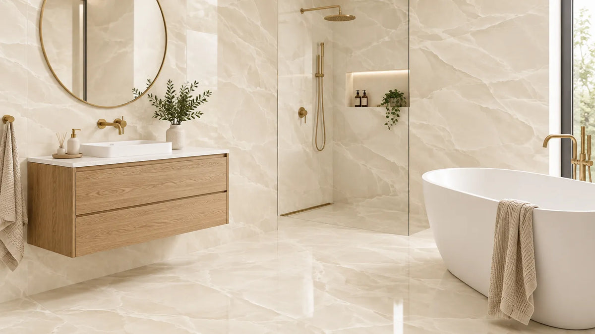
For most bathrooms, a satin-finish cream porcelain tile in a 60x120cm format is the safest specification. Satin holds the warmth that makes cream worth choosing, without the glare of polish or the soap-scum drag of a deep matt texture. The decision that follows matters more than the tile itself: cream sits around 70 to 80 on the light reflectance scale, so it turns grey and flat the moment you set it against bright white sanitaryware. Get the undertone and the grout shade right and cream stays warm for twenty years. Get them wrong and the room reads dated within two.
Start With the Room, Not the Tile
Cream behaves differently in every bathroom, and the light coming through your window decides most of it. A north-facing room strips the warmth out of a cream tile, while a south-facing room pushes that same tile towards yellow. Before you shortlist anything, work out what your room does to light across a full day.
| Your bathroom | Best cream shade | Best finish | Best format | Floor slip rating |
|---|---|---|---|---|
| North-facing, little daylight | Warm cream, yellow undertone | Satin | 60x120cm | R10 |
| South-facing, bright | Cool cream or ivory | Matt | 60x60cm or 60x120cm | R10 |
| Small, under 4m² | Ivory to light cream | Satin or polished walls | 30x60cm walls, 60x60cm floor | R10 |
| Windowless, spotlit only | Warm cream | Satin | 60x120cm | R10 |
| Wet room or open shower | Any cream | Matt, textured body | 60x60cm | R11 |
| Family bathroom, heavy use | Mid cream, stone effect | Matt | 60x120cm | R10 |
Match the Shade to Your Window Direction
North light is cool and blue, and it quietly drains the yellow out of any surface it touches. A cool cream can therefore turn slightly grey by mid-afternoon, so pick a cream with a visible yellow or gold undertone and the room stays warm all day.
South light does the opposite, amplifying yellow until a warm cream starts to look like cheap magnolia. In a bright, south-facing bathroom, a cooler cream or a true ivory will hold its composure far better.
Windowless bathrooms depend entirely on the lamps you fit above them. Warm LED lighting at around 2700K flatters cream, while cooler 4000K lighting leaves the same tile looking washed out and clinical.
Match the Finish to the Surface
Walls and floors want different things from the same colour. Walls can take shine, because nobody stands on them, while floors need grip and a surface that forgives everyday water.
The common mistake is buying one polished tile and running it across every surface in the room. It looks superb under showroom lighting, then turns slippery underfoot and shows every water spot at eye level.

Cream, Ivory, Magnolia or Beige?
Tile listings use these four words almost interchangeably, yet they describe four genuinely different colours. Mixing them up is how people end up with a bathroom that never quite looks right, whatever they spend on it.
Cream is a warm off-white carrying a yellow or faintly red undertone, while ivory sits lighter and closer to true white. Magnolia holds more yellow with a hint of pink behind it. Beige is the real outlier, because it leans grey or brown and belongs to a different colour family altogether.
| Shade | Light reflectance | Undertone | Reads as | Best paired with |
|---|---|---|---|---|
| Ivory | 80–85 | Very faint yellow | Almost white, crisp | Chrome, cool marble, white suites |
| Cream | 70–80 | Yellow to soft red | Warm, soft, buttery | Brass, oak, bone sanitaryware |
| Magnolia | 68–76 | Yellow with pink | Dated if used flat | Deep green, terracotta, texture |
| Beige | 55–70 | Grey or brown | Cooler, earthy, muted | Charcoal, taupe, black fittings |
If your scheme is pulling towards grey and brown rather than warmth, you are working with beige, and our guide to beige bathroom tile schemes covers those pairings in full.
Light Reflectance Value: The Number No Tile Listing Prints
Light reflectance value, usually shortened to LRV, measures how much light a surface bounces back into the room. Pure white sits near 100, and deep black sits near zero.
Cream tiles typically land between 70 and 80, and that single number explains almost everything about how a cream bathroom feels. Above 80 the room reads bright and slightly cold, while below 70 it starts to feel enclosed and heavy.
Tile manufacturers rarely publish LRV figures, even though paint brands print them for every shade they sell. You can still judge it accurately by eye once you know what you are looking for.
Read the Undertone Before You Read the Name
Hold your cream sample against a sheet of plain printer paper, which sits close enough to pure white to expose the undertone instantly.
A tile that looks yellow against that paper is a warm cream, while one that looks faintly pink is closer to magnolia. If it looks grey or muddy against the same sheet, you are holding beige, whatever the product name on the box says.
The whole test takes ten seconds and prevents the most expensive mistake in neutral bathrooms.
The Three-Sample Daylight Test
Order three shades rather than one, and lay them on the bathroom floor instead of a table beside the window.
Check them three times a day: in the morning, in mid-afternoon, and at night under your own lights. Cream shifts more across a single day than any other bathroom colour, so a tile that looks perfect at 11am can look yellow and tired by 8pm.
Leave the samples down for two full days before you commit to an order.
Why Cream Turns Grey Against White Sanitaryware
Here is the problem almost nobody warns you about before the tiles arrive. Standard white acrylic baths, basins and toilets sit at roughly 90 to 95 on the reflectance scale, while your cream tile sits nearer 72.
Set the two side by side and your eye quietly calibrates itself to the brightest surface in the room. The bath becomes the new white, and the cream tile beside it now reads dull, grey and faintly dirty. Nothing about the tile has changed, only your perception of it.
This single effect is the most common reason people end up disliking a finished cream bathroom.
Closing the Reflectance Gap
Three practical fixes exist, and any one of them solves the problem on its own.
The simplest is to choose bone, almond or off-white sanitaryware instead of bright white, which narrows the gap and lets the cream read warm again. Many premium bathroom suites already offer an off-white option at no extra cost.
Alternatively, break the two surfaces apart by inserting a mid-tone element between them: a walnut vanity, a charcoal shower frame, or a brushed brass tap. Your eye then stops comparing the tile directly against the bath.
The third option is to lean into the contrast deliberately, pairing a bright white suite with a noticeably deeper cream closer to a light stone tone. A wide gap reads as a design decision, while a narrow gap simply reads as a mistake.

Matt, Satin or Polished: Living With Each Finish
Finish changes how cream behaves more than shade does. A polished cream and a matt cream from the same production batch can look like two different colours on the wall.
| Finish | Light behaviour | Cleaning | Best used on | Watch out for |
|---|---|---|---|---|
| Matt | Absorbs light, mutes the colour | Hides water marks, holds soap scum | Floors, wet rooms, family bathrooms | Can look flat in dark rooms |
| Satin | Soft sheen, keeps warmth | Easiest all-round | Walls and floors, most bathrooms | Very few drawbacks |
| Polished | Reflects light, deepens colour | Shows every droplet and footprint | Feature walls, dry areas | Slippery when wet |
Satin is the finish most people should buy and the one showrooms mention least. It carries enough sheen to keep cream looking rich, yet it does not throw glare or turn into an ice rink underfoot.
Where Polished Cream Belongs, and Where It Does Not
Polished cream, particularly marble-effect and onyx-effect bodies, looks superb on a feature wall behind a freestanding bath. Light travels across the veining and the room gains real depth.
Polished cream does not belong on a shower floor. Many polished bodies are wall-rated only, and the ones rated for floors still lose grip fast when wet and soapy.
Keep polish above the waterline and you get the drama without the risk.
Satin, the Under-Specified Middle Ground
Satin sits between matt and polish, and it solves the problem both create. It reflects enough light to stop cream looking chalky in a north-facing room. It scatters that light softly, so water spots do not stand out the way they do on a polished surface.
For a single-tile bathroom running wall to floor, satin is the specification that fails least often. Our matt bathroom tile buying guide explains where a true matt still wins, mainly in wet rooms and busy family bathrooms.
Soap Scum, Limescale and Hard-Water Districts
Cream has one genuine practical advantage. It masks limescale better than almost any other tile colour, because dried mineral deposits are themselves pale. On a dark grey or black tile, the same deposits announce themselves within days.
Soap scum works the other way. It forms a slightly greyish film, and it clings more readily to a textured matt surface than to a smooth satin one. In a hard-water area with a busy shower, a satin cream wall stays looking clean with less effort than a deeply textured matt one.
None of this makes matt a poor choice. It simply means you should match the finish to how often that surface actually gets wet.

You can compare finishes side by side across the full cream bathroom wall and floor tiles collection, where factory-direct sourcing keeps premium Italian and Spanish porcelain at wholesale pricing.
Check the Slip Rating Before the Shade
Slip rating is the one specification worth confirming before you fall in love with a tile. It is also the detail most cream tile pages leave out entirely.
Bathroom floors should be R10 as a minimum under the DIN 51130 ramp test, while shower floors, wet rooms and open walk-in areas need R11. Anything rated R9 belongs on a wall or in a dry hallway.
Wet-Barefoot Zones and Shower Trays
The risk zone is not the whole floor, but the metre or so where water lands and soap collects.
Plenty of homeowners tile the main floor in a well-rated cream, then continue that same tile straight into the shower enclosure. If the tile is only R10, that shower area is under-specified. Either step up to an R11 body for the shower zone, or choose R11 throughout and accept a slightly more textured feel underfoot.
Smaller formats help as well, because more grout joints mean more grip, which is why 30x30cm and mosaic-cut tiles remain common on shower floors. The full anti-slip bathroom floor tiles range lists the rating against every product, so you are not guessing from a photograph.
How Tile Size Changes the Perceived Warmth
Format does something subtle to cream that most buying guides miss entirely. Grout lines interrupt the colour field, so the more joints you introduce, the more the eye reads texture rather than warmth.
Bathrooms Under Four Square Metres
Conventional advice says small tiles suit small rooms, but for cream the opposite usually holds true.
A 60x60cm or 60x120cm floor tile gives a small bathroom a continuous, calm surface. Fewer joints mean fewer visual breaks, so the room feels noticeably larger than its measurements suggest. On walls, 30x60cm laid horizontally stretches the space sideways.
Keep the grout close in tone and a compact cream bathroom reads as one soft envelope rather than a grid.
Wall-to-Floor Continuity in Large Format
Running the same cream tile from floor to ceiling is the quickest route to a hotel-quality finish. Large-format porcelain makes it achievable, because 600x1200mm and 1200x1200mm panels cover an entire wall in a handful of pieces.
Rectified edges matter a great deal here. A rectified tile is mechanically cut square after firing, which allows joints as tight as 2mm, and at that width the grout almost disappears and the cream surface flows uninterrupted.
Large slabs used to carry a heavy premium. Buying factory-direct from Italian and Spanish production removes the distributor markup, which is why extra-large cream porcelain now sits within reach of a standard bathroom budget.
Grout Shade Dates a Cream Bathroom Faster Than the Tile
Ask any tiler where cream bathrooms are won or lost and you will hear the same one-word answer: grout.
It is a question people genuinely struggle with, and one tiling forum thread on grout colour for cream tiles has drawn over eleven thousand views against barely three replies. The demand for a clear answer is obvious, yet the answer itself is rarely given.
Blend, Shadow or Contrast: Pick One Strategy
Three valid approaches exist, and problems start only when you drift between them by accident.
| Strategy | Grout tone | Effect | Best for |
|---|---|---|---|
| Blend | Jasmine, ivory, light cream | Joints disappear, surface flows | Large format, small bathrooms, calm schemes |
| Shadow | Beige, light taupe, one to two shades deeper | Gentle definition, hides everyday marks | Family bathrooms, floors, stone-effect cream |
| Contrast | Warm grey or charcoal | Graphic grid, joints become the pattern | Metro and brick-bond walls, period schemes |
Blend is the default for large-format cream, while shadow is the practical choice for floors, because a slightly deeper grout keeps looking clean between deep cleans. Contrast works too, but only when the layout is deliberate, such as a stacked or herringbone metro wall.
Why White Grout Reads Cold Against Cream
Bright white grout is the most common default and the weakest choice you can make for cream.
White grout sits higher on the light scale than the tile around it, so the joints glow, the cream looks duller by comparison, and the whole wall picks up a faintly cool cast. It is the same reflectance problem the white bath creates, repeated hundreds of times across every joint in the room.
White grout also punishes imperfect cuts, because every millimetre of variation in a joint line becomes visible. A jasmine or soft ivory grout forgives far more and costs exactly the same per bag.
One practical note before you order: choose an improved grout rated for wet areas and reduced water absorption. Cheap grout in a cream bathroom discolours unevenly, and patchy grout ages a room faster than the tile itself ever will.

Six Cream Schemes That Do Not Read as 1998
Cream earned a bad reputation in the nineties, and the reason was never the colour itself. The problem was uniform 20x20cm matt tiles, bright white grout, gold-effect trim strips and no texture variation anywhere in the room. Change those four things and cream reads as entirely current.
Cream With Warm Brass and Oak
This is the most reliable modern scheme: a large-format satin cream wall, an oak or walnut vanity, and brushed brass taps and handles throughout.
Brass shares cream's yellow undertone, so the metal reads as intentional rather than dated. Keep the brass brushed rather than polished and the whole scheme stays quiet.
Cream With Charcoal and Black Sanitaryware
Cream needs an anchor somewhere in the room. A charcoal shower screen frame, a matt black tap or a dark stone basin all give the eye somewhere firm to land.
That contrast is what stops cream drifting into blandness, though black works best used sparingly across two or three elements at most.
Cream With Sage and Olive
Muted greens sit beautifully against warm cream, because both are low-saturation tones drawn from nature. A sage painted ceiling above cream tiles feels calm and considered rather than decorated.
The pairing suits period homes and cottage bathrooms particularly well.
Cream With Terracotta and Clay
This is the warmer, more Mediterranean direction, where cream walls sit above a terracotta or clay-toned floor and create real depth without introducing a single cool colour.
Add unglazed texture somewhere, in a pot or a stool, to keep the scheme from looking flat.
Cream With Travertine Texture
Texture is what separates modern cream from nineties cream, and travertine-effect and stone-effect porcelain bodies carry natural pitting and tonal movement across every tile.
The colour itself stays cream, but the surface stops being uniform, and that change alone updates the room by a decade.
Cream With Crisp White, Done Correctly
You can pair cream with bright white, provided you give the two a reason to sit together. Introduce a third element between them: a mid-tone timber shelf, a veined marble-effect panel, or a soft grey mosaic band.
Marble-effect and onyx-effect cream porcelain works especially well here, because the veining already contains both tones. A polished cream onyx feature wall behind a white freestanding bath reads as luxury rather than mismatch.
Will Cream Tiles Yellow, Stain or Date?
Yellowing worries people, and the honest answer depends entirely on the material.
Glazed porcelain does not yellow at all. The surface is a fired glass layer, sealed and non-porous, so it holds its colour for the working life of the tile. Neither sunlight nor cleaning products will shift it.
Glazed ceramic behaves the same way on the surface, though the body underneath is softer and more absorbent. That difference matters for chips and impact damage, not for colour.
Natural stone is the real exception here. Unsealed travertine and limestone in the cream family absorb water, soap and oils over time, and they do darken and patch unevenly. Sealed correctly they last extremely well, but left unsealed in a shower they will not.
Glazed Porcelain Against Ceramic Against Natural Limestone
Porcelain absorbs almost no water, which is exactly what makes it the default choice for bathroom floors and wet rooms. Ceramic absorbs considerably more, so ceramic belongs on walls and in lighter-use areas. Natural limestone is porous by nature and needs regular resealing to stay cream rather than blotchy.
For a bathroom you want to forget about for fifteen years, glazed cream porcelain is the answer. For a feature wall in a guest bathroom, ceramic is perfectly sound and costs noticeably less.
Work Out Coverage and Cost Before You Order
Cream porcelain spans a wide price range, from budget ceramic wall tiles to large-format Italian slabs. The bigger variable is usually quantity, not unit price.
Order 10% extra for a straight lay and 15% for diagonal or herringbone patterns, since cuts, breakages and future repairs all come out of that margin. Buying a second batch later risks a visible shade difference, because tile batches vary slightly between production runs.
Check the batch number on every pallet before the tiler opens a box. Our guide to calculating bathroom tile quantities walks through the measurements room by room.
Full-pallet orders usually attract a volume discount, which is worth checking if you are tiling wall to floor in large format.
Specification Checklist
Run through this before you place the order.
- Sampled three cream shades in your own bathroom, across morning, afternoon and evening light
- Checked the undertone against plain white paper
- Confirmed the shade works against your chosen sanitaryware colour
- Floor tile rated R10 minimum, shower zone R11
- Finish matched to surface: satin or matt on floors, any finish on walls
- Grout strategy chosen deliberately: blend, shadow or contrast
- Grout specified for wet areas with reduced water absorption
- Rectified edges confirmed if you want joints under 3mm
- Quantity includes 10-15% wastage
- All boxes from a single batch number
Cream Bathroom Tile Questions, Answered
What colour grout suits cream bathroom tiles?
Jasmine or ivory grout is the safest choice, because it blends into the tile and keeps the surface calm. For floors, a beige grout one or two shades deeper hides everyday marks while still looking intentional. Avoid bright white, which reads cool against cream and highlights every uneven joint.
Are cream tiles a good choice for a small bathroom?
Yes, and large formats work better than small ones. A 60x60cm or 60x120cm cream tile gives fewer grout lines, so the floor reads as a single continuous surface and the room feels larger. Keep the grout close in tone and choose a satin finish to bounce light without glare.
Do cream bathroom tiles look dated in 2026?
Cream itself is not dated. The nineties look came from small uniform matt tiles, white grout and gold trim. Modern cream avoids all three, using large formats, textured stone and travertine effects, tonal grout and brushed rather than polished metals.
What colours go with cream bathroom tiles?
Brushed brass, oak and walnut are the most reliable partners, since they share cream's warm undertone. Charcoal and matt black work well as anchors, used sparingly. Sage green, olive and terracotta all sit comfortably against cream, while bright white needs a mid-tone element placed between the two.
Should cream bathroom tiles be matt or polished?
Satin suits most bathrooms, sitting between the two and avoiding the drawbacks of each. Choose matt for shower floors and wet rooms where grip matters most. Keep polished cream on feature walls and dry areas, where its reflection adds depth without creating a slip risk.